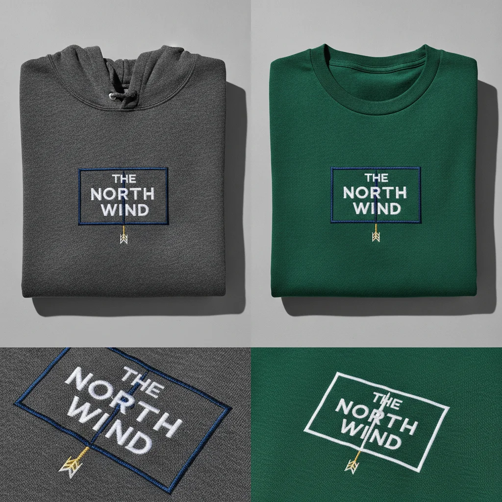
Premium Apparel Decoration Comparison Mockup: Embroidery vs. Print
Prompt
use the uploaded logo or artwork as the strict and exact reference. create a detailed commercial apparel-decoration comparison showing two accurate applications of the same design: realistic thread embroidery on [garment and placement], and realistic screen print or dtf print on [garment and placement]. preserve the artwork’s exact spelling, typography, symbol, colours, line structure, internal spacing and proportions in both applications. do not replace fonts, alter letters or simplify the artwork beyond genuine production limitations. include one normal product view displaying both decorated garments or clearly separated application areas, plus two macro close-ups: one embroidery detail and one print detail. for the embroidery, reproduce individual thread direction, stitch density, thread sheen, clean borders, slight raised texture and natural fabric compression. avoid loose threads, overly thick outlines or changed letter shapes. for the printed version, reproduce realistic ink coverage, correct colour density and natural interaction with the fabric weave without making the artwork appear like a plastic digital sticker. use soft directional studio lighting, a neutral background and controlled shadows that reveal the decoration texture. treat the uploaded garment and artwork as strict references. preserve the exact spelling, typography, colours, symbol, proportions, fabric, stitching, fit and requested placement. do not redesign the artwork, invent details, add branding or change the garment construction. no model, hanger, props, watermark, added text or inaccurate production effects. premium embroidery and garment-print comparison mockup, ultra-realistic 8k quality, square 1:1 aspect ratio.
Want to see this prompt?
to unlock it.
Related Prompts
See all in Mockups and BrandingNo matching content